According to Medline Plus, 1 in 12 males and 1 in 200 females has a red-green color deficiency. Color blindness, or the inability to see some colors in the usual way, occurs when there is a problem with the pigments in certain nerve cells of the eye that sense color. With color blindness or color deficiencies being so common, why wouldn’t you do some simple things to make your website more accessible?
Website and Digital Accessibility is complex, and I’m dramatically minimizing the work that goes into this effort. Most software now has built-in features that focus on accessibility and that is also true for many things we use at ISU. The About.IllinoisState.edu website system does focus on accessibility. Here are some things that you can do (or not do) to help!
Don’t change colors or font sizes unless absolutely necessary or you’re willing to put in the work.
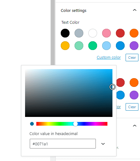
If you do find color changes necessary, use a web tool to test your color combinations or Adobe Color to determine your site’s color palette. The color code from Adobe Color can then be entered as a custom color in your About.IllinoisState.edu website.
Color alone should not convey information.
Everyone loves to color code things, I get it. I’m also not saying to stop color coding because it can be extremely helpful to many. However, color should never be the only way to convey something!
You may be tempted to ‘highlight’ text on your webpage with a yellow background.
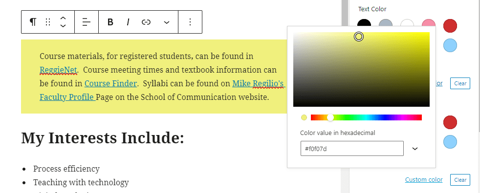
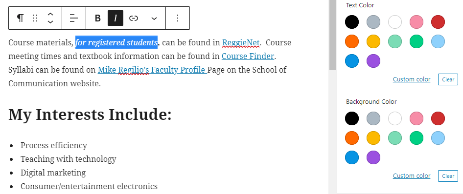
Visually, it may draw someone’s attention but it’s better to ‘code’ the importance of that text too! You can do this by using the “B” and “I” options. They may look like bold and italic (and those words even pop up when you hover your mouse over the buttons for a second) but in the underlying code we’re actually assigning the semantic meaning of ‘strong‘ and ‘emphasis‘ respectively. Someone who uses screen reader software will then have that text read differently whereas the ‘highlight’ approach wouldn’t.
Focus on content, don’t sweat the small stuff!
Sure, we all love to get things perfect. Remember, most important is your content! Getting the visuals like placement, colors, fonts, size, etc. are important but unless you’re prepared to get a degree in web development then you’re probably not going to get it perfect anyway. That’s no dig on you. Seriously. Websites require very complex coding to be sure they work well on the smallest phone to the largest computer monitors, for people who can see all the content and for people who listen to the content, and much more. About.IllinoisState.edu takes care of much of this for you when you leave the default colors and font sizes in place, and when you don’t try to trick the system in to placing something in a specific spot. My advice: let that s*** go. 😊